Foundation
Visual identity matters
Consistency builds trust. Every element serves a purpose in our brand.
01
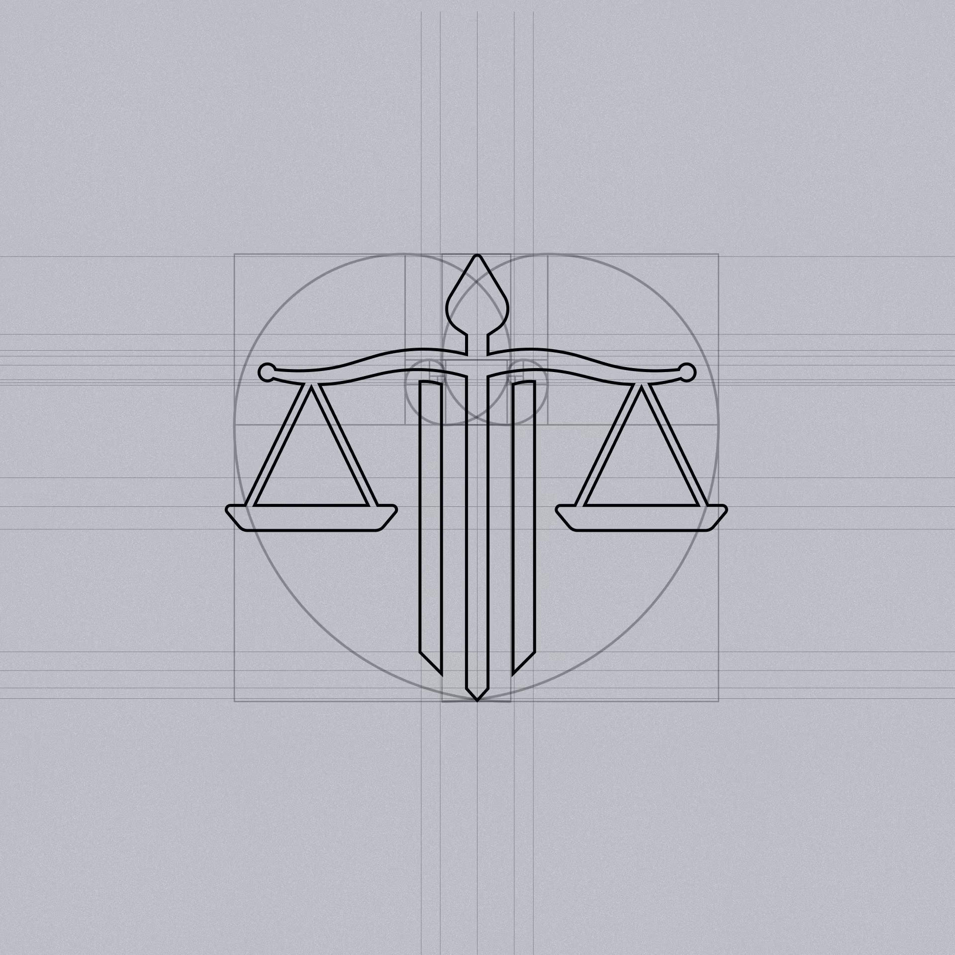
Logo usage
Mark
Our mark speaks clearly
The logo is built on precision. It remains recognisable across every application, from letterhead to digital screens.
02
Color palette
Hierarchy
Colour guides the eye
Our palette is restrained and purposeful. Each shade reinforces authority and professionalism in every document.

03
Typography
Voice
Type carries our message
Typeface selection matters in law. We maintain consistent weights and spacing to ensure every word lands with weight.

04
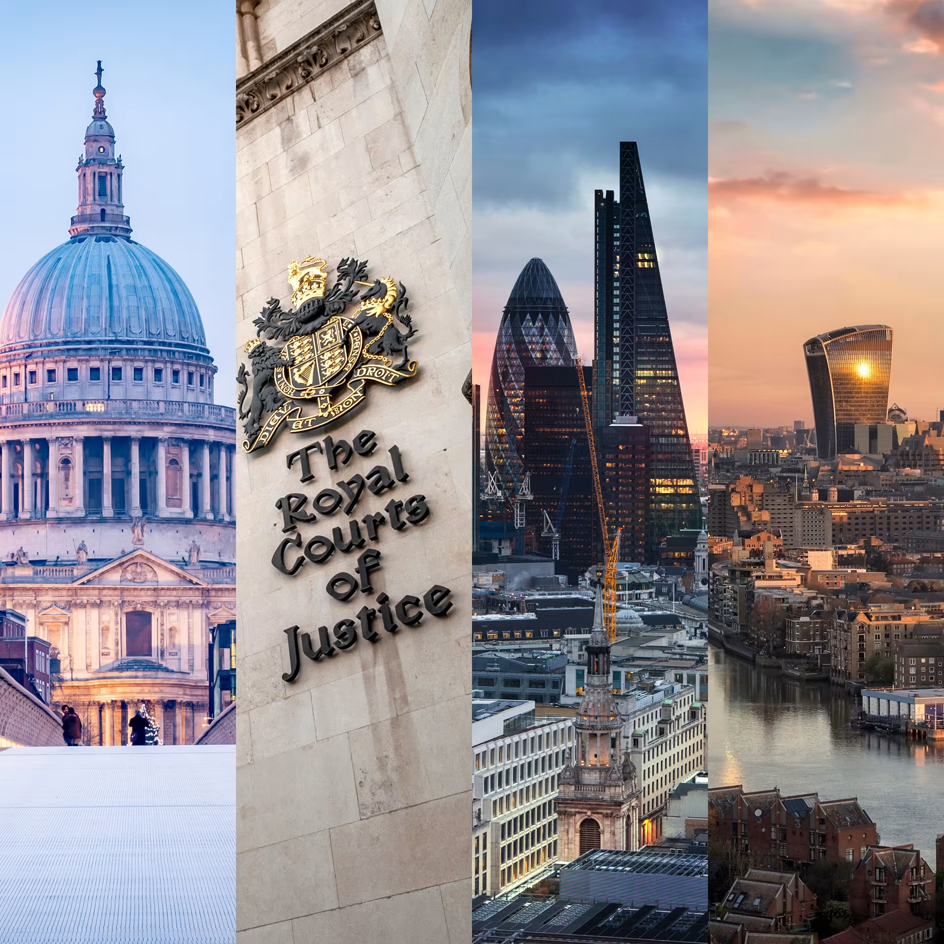
Imagery style
Substance
Images must earn their place
Photography and illustration should evoke an emotion and have a purpose. Nothing decorative; everything serves the message.